STAY MORE Flagship Store
STAY MORE Flagship Store
STAY Architects
ARCHITECTS
Stay Architects
LANDSCAPE ARCHITECTURE
Botanical Studio Sam
LEAD ARCHITECTS
Junghee Hong
DESIGN TEAM
Pansu Kim, Youngdo Kim
YEAR
2024
LOCATION
South Korea
CATEGORY
Showroom
Text description provided by architect.
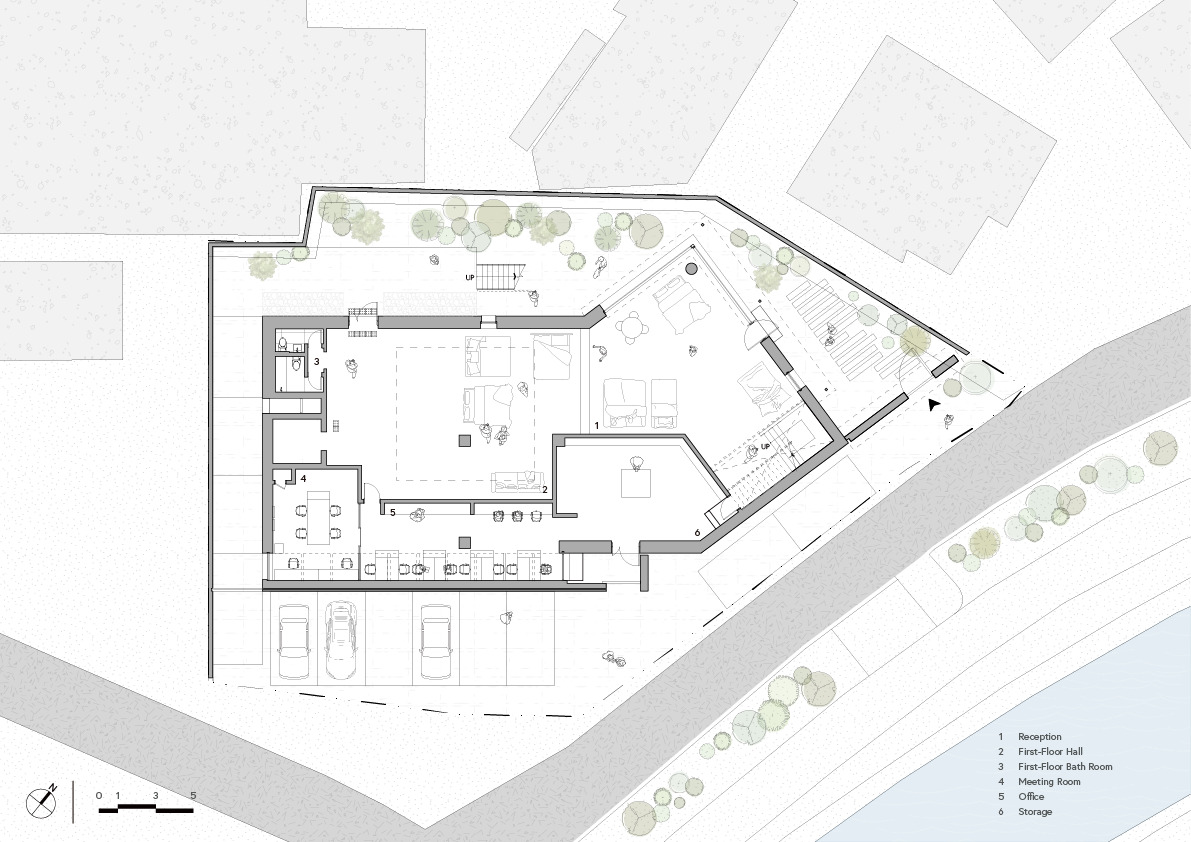
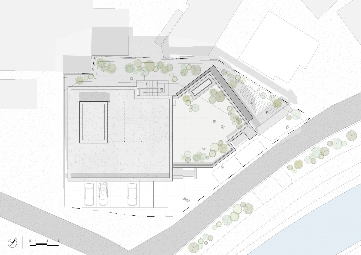
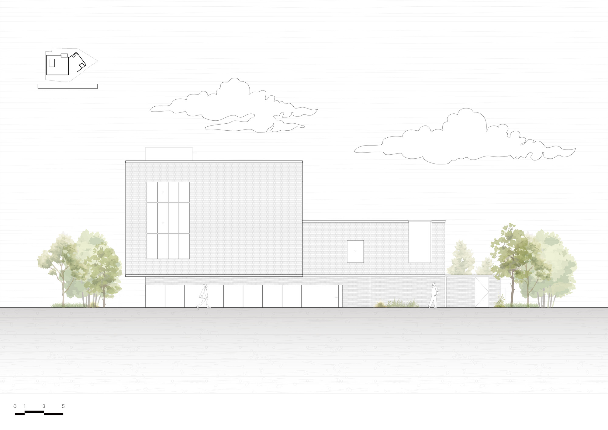
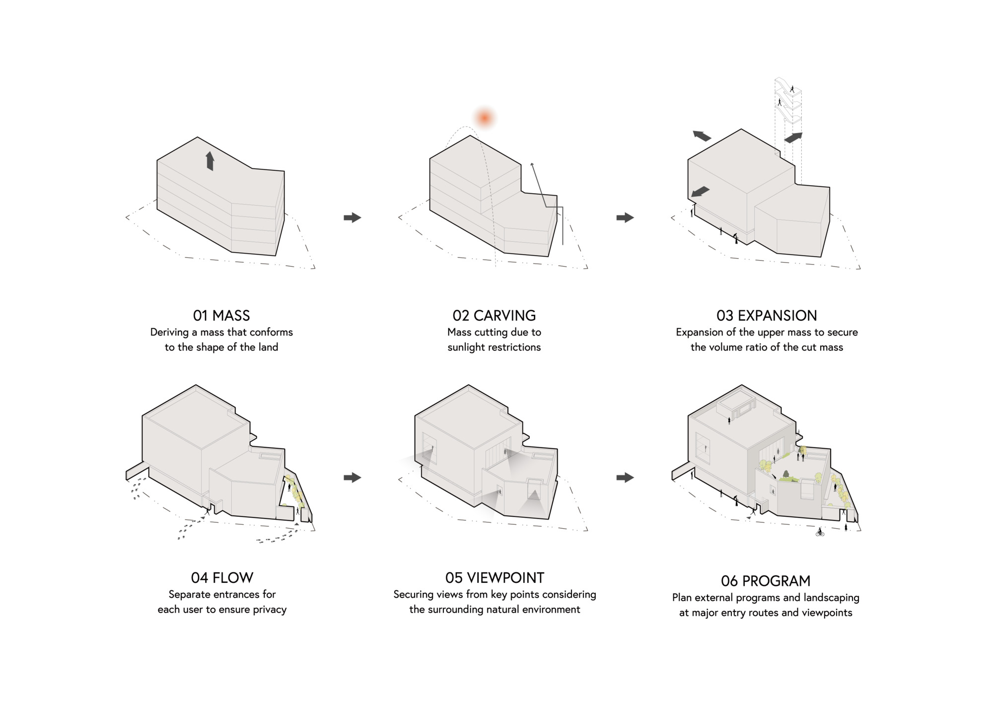
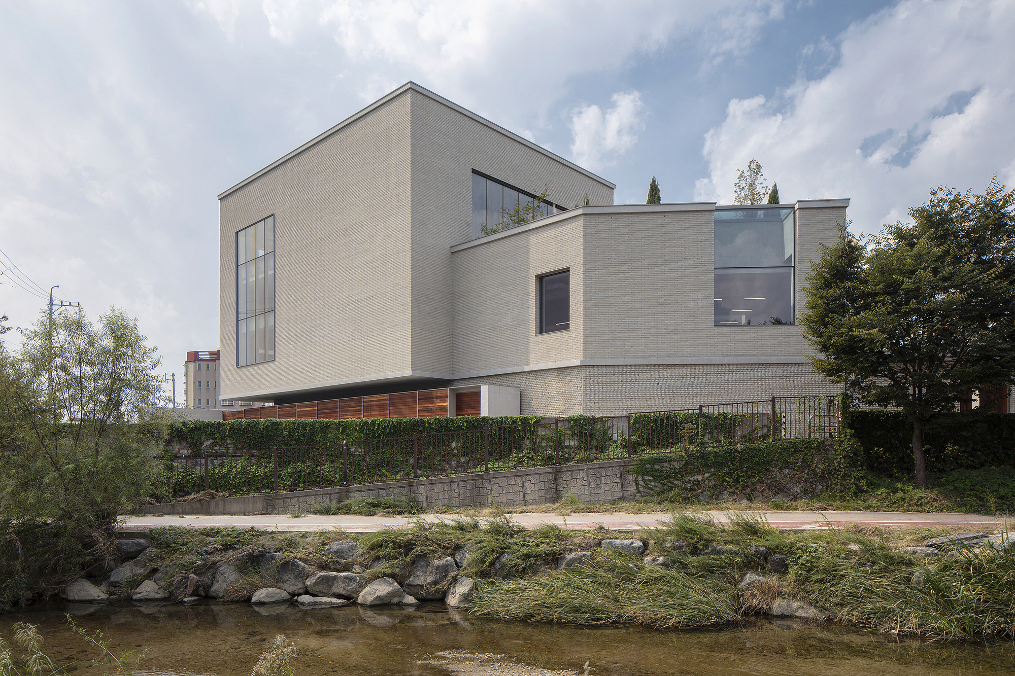
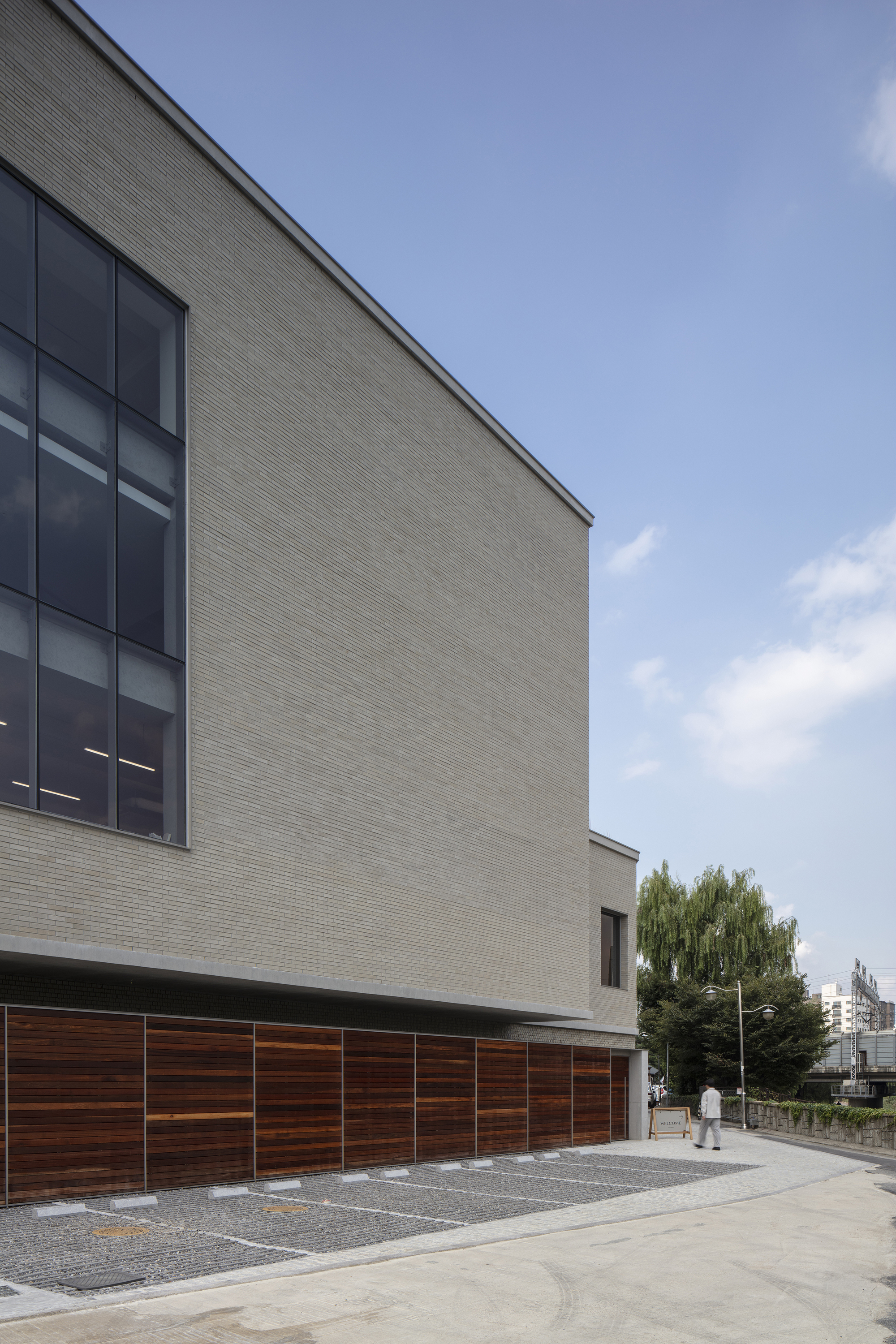
The Staymore flagship store is located on a site with a view of the pedestrian park along the Suwoncheon River and the subway passing by beyond it. The 300-pyeong site, located at the corner of three roads, was an irregular trapezoidal shape.
Reflecting the brand's characteristics of offering a comfortable bedroom lifestyle, the building was designed to be as low and wide as possible, and the building was naturally derived as a polygonal mass following the maximum building-to-land ratio.
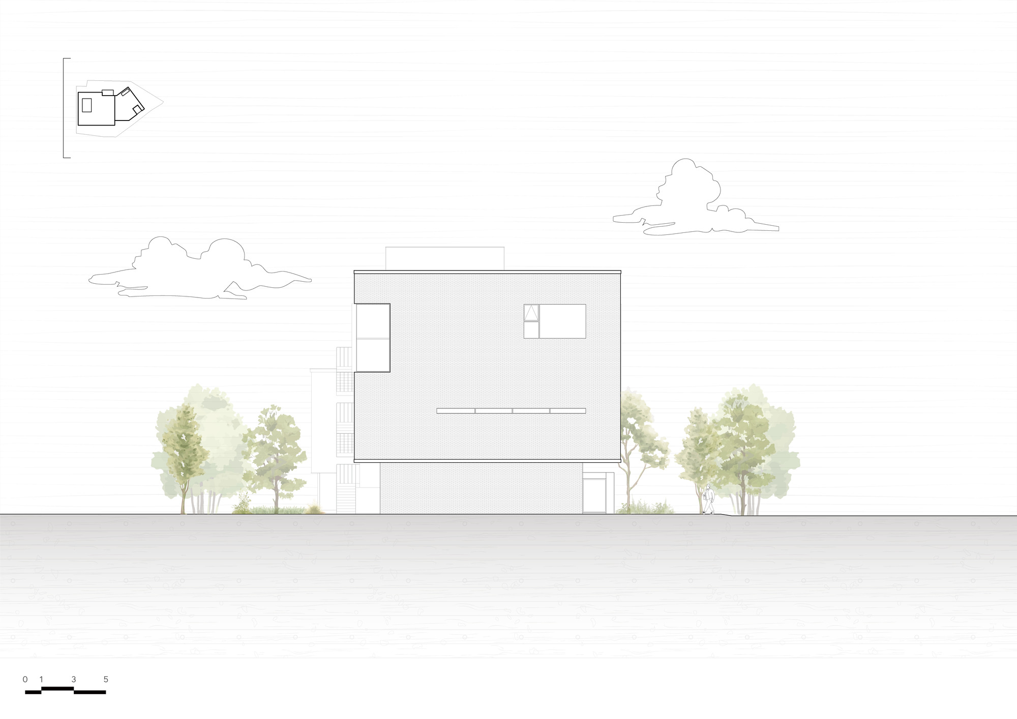
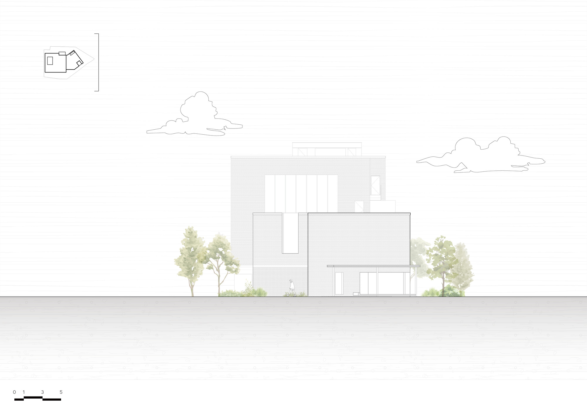
As a result, the building blends in well with the low-development rate surrounding landscape and the Suwoncheon pedestrian park, and the observer experiences different faces of the building depending on the point of view from which they stand.
From the early stages of the design, various simulations were conducted on the movement paths of the building's managers and visitors, and the final plan was selected.
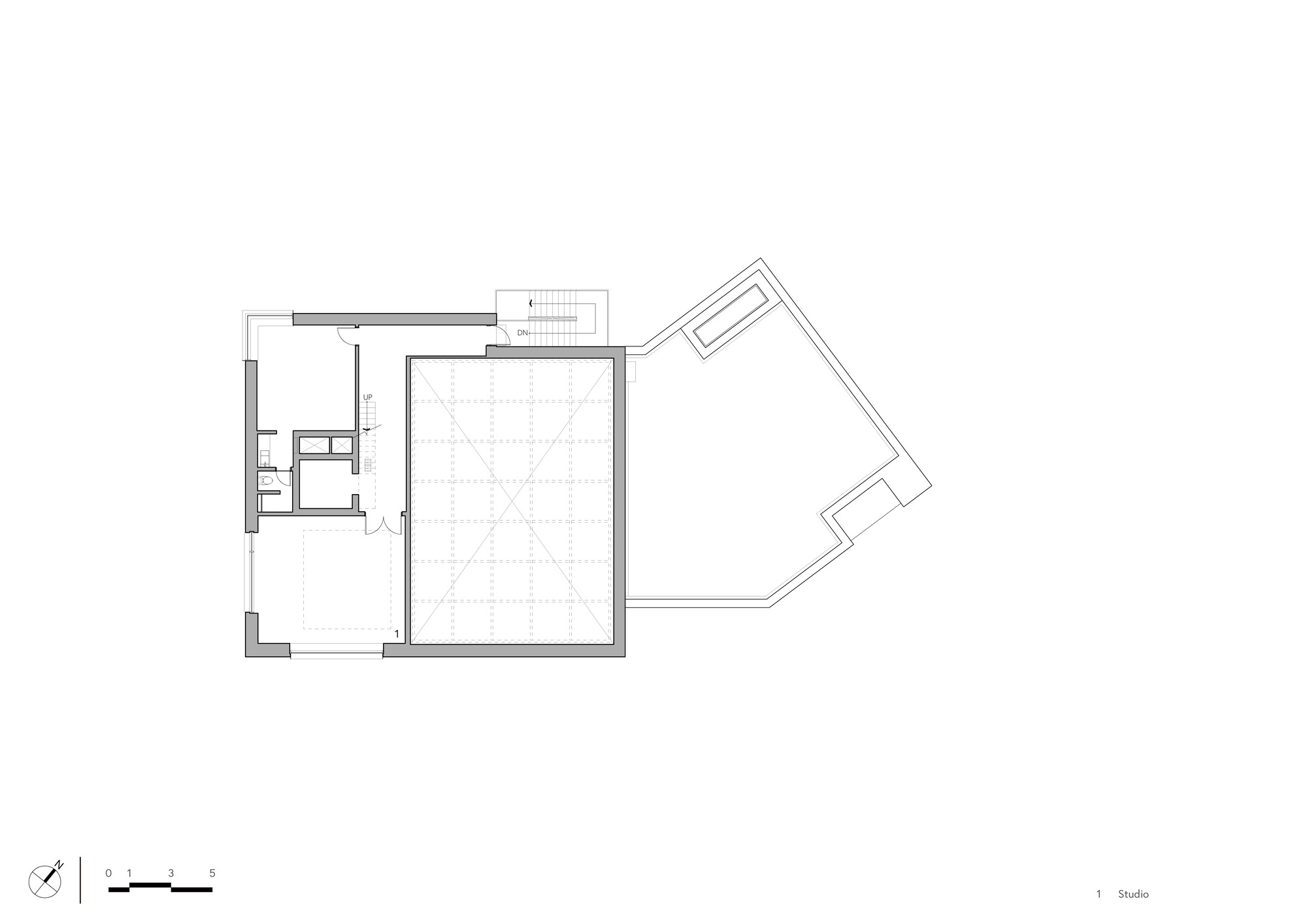
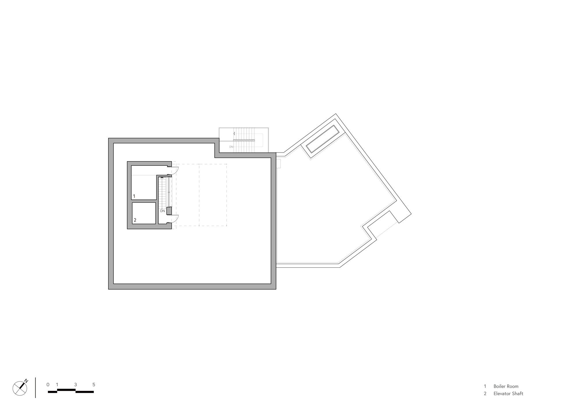
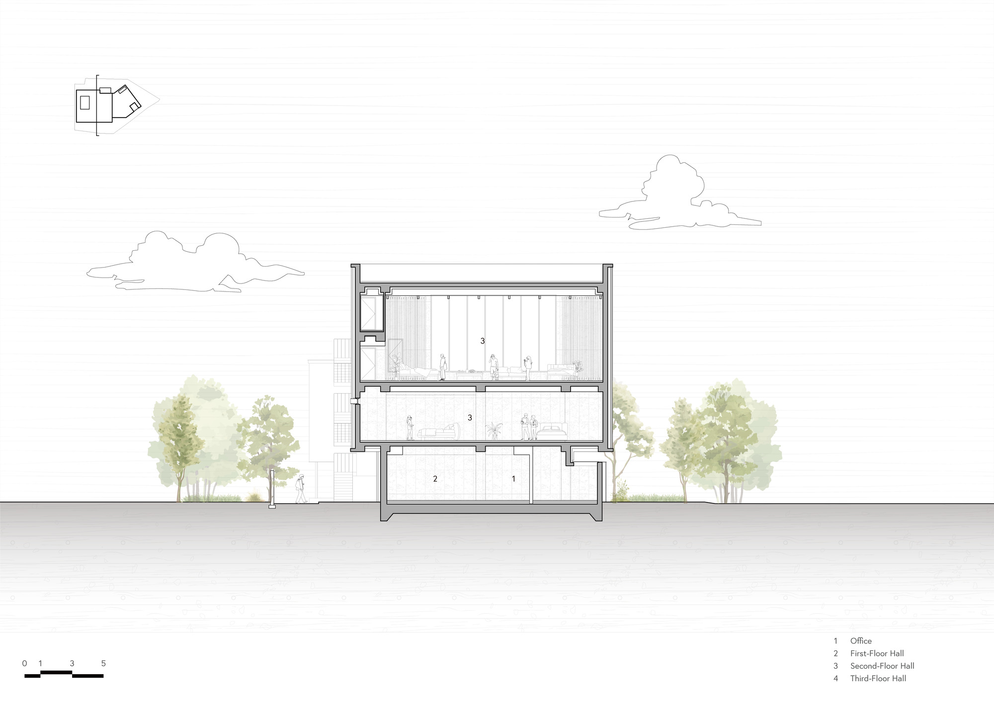
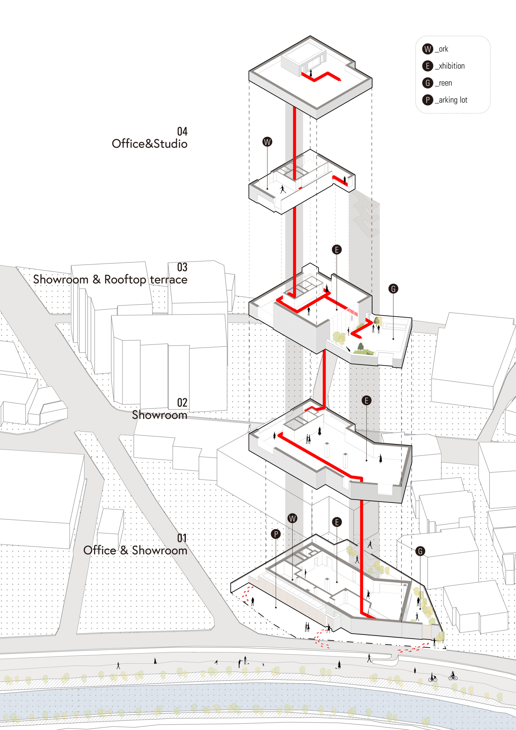
In order to satisfy both the purposes of the office building and the showroom, it was necessary to separate the movement paths of the managers and customers and create the necessary movement paths for each user.
A long detour was created for customers through the west gate of the site, and an administrator entrance was planned on the south side, which is the front of the building, that can be entered directly from the parking lot.
The customer first encounters the widest southern facade of the building, and while bypassing the site through the west gate, he or she views the sharp façade of the building.
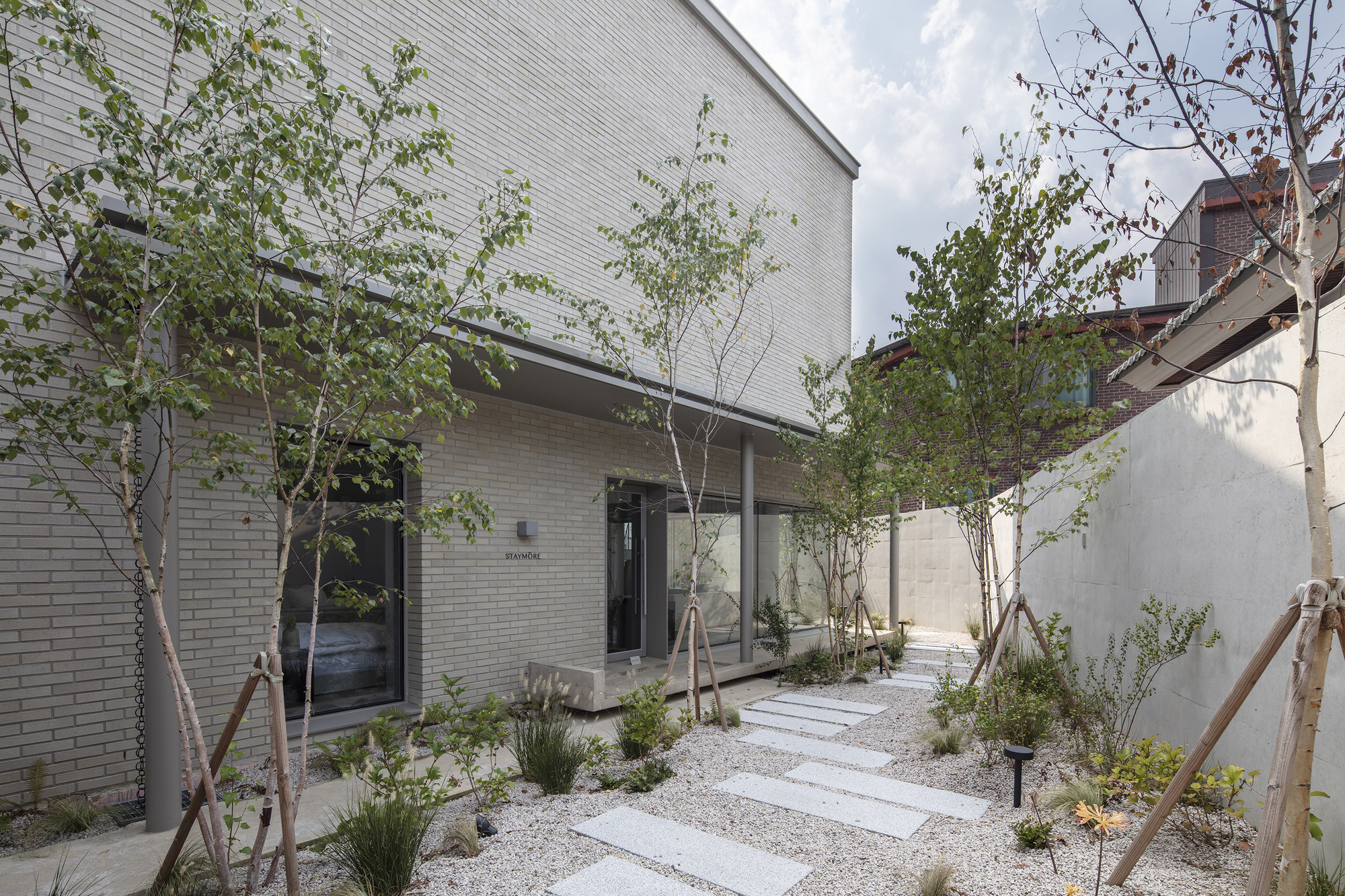
After entering the site through the gate, he or she walks around the private garden and takes a look around the building before heading to the lobby at the back of the building.
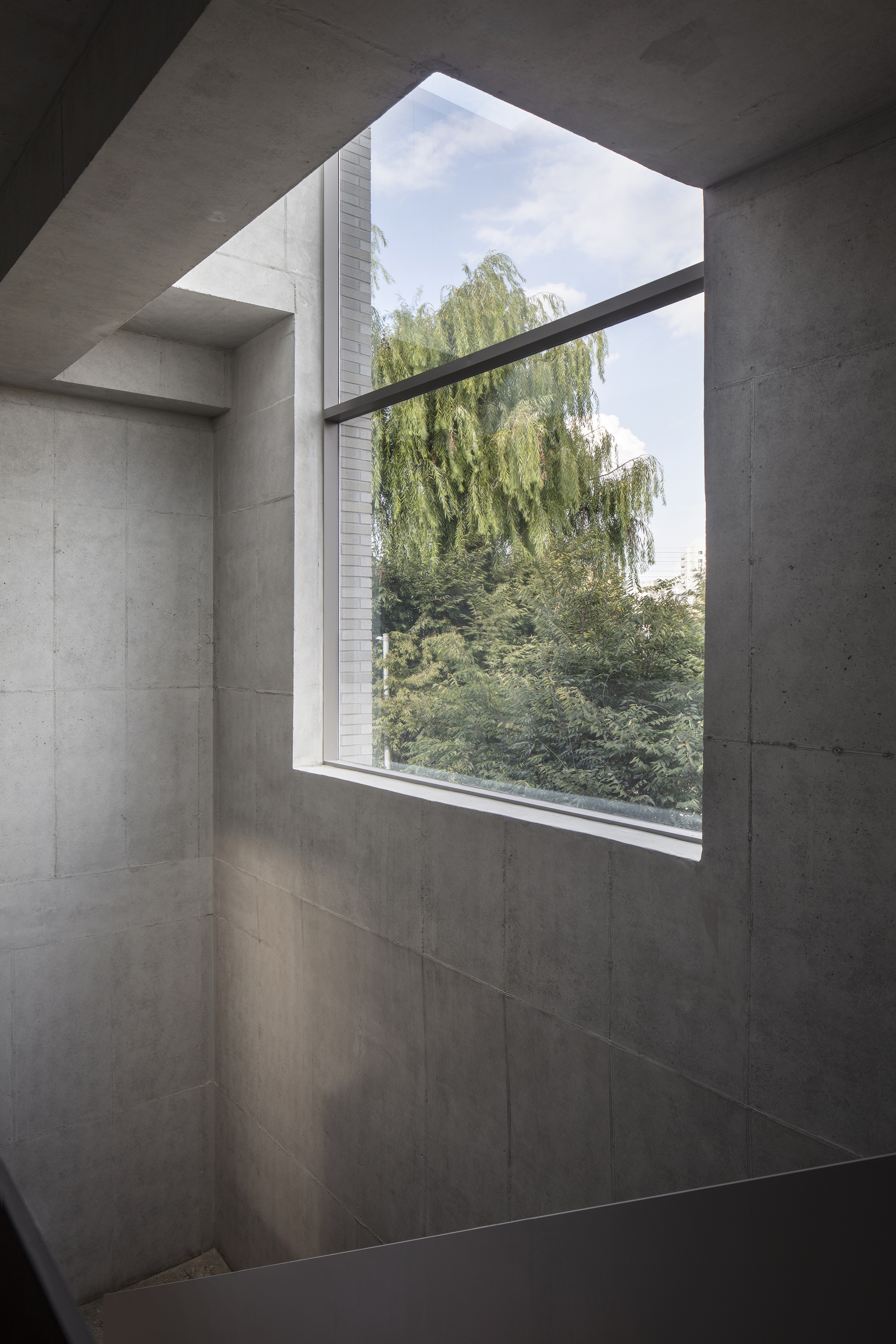
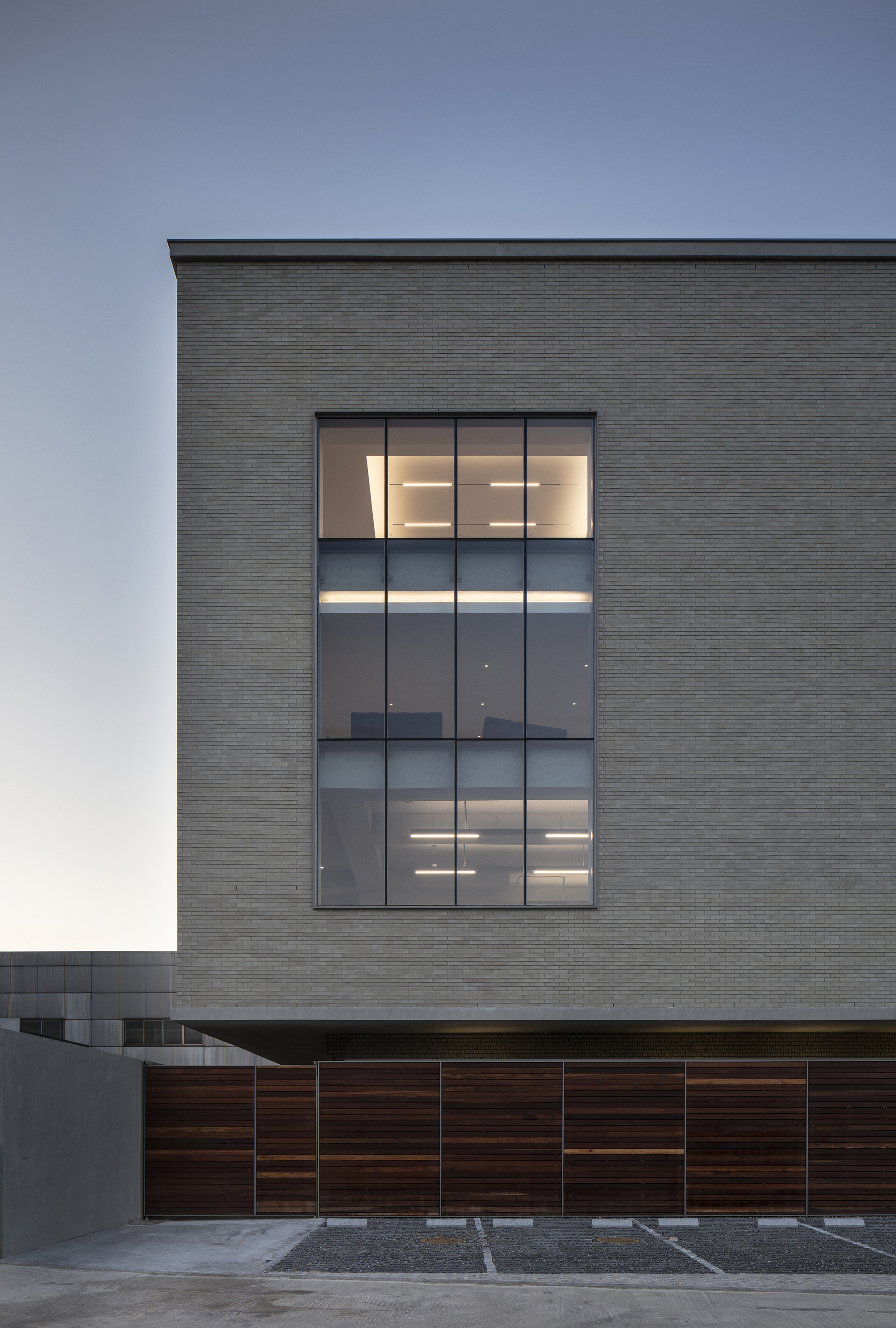
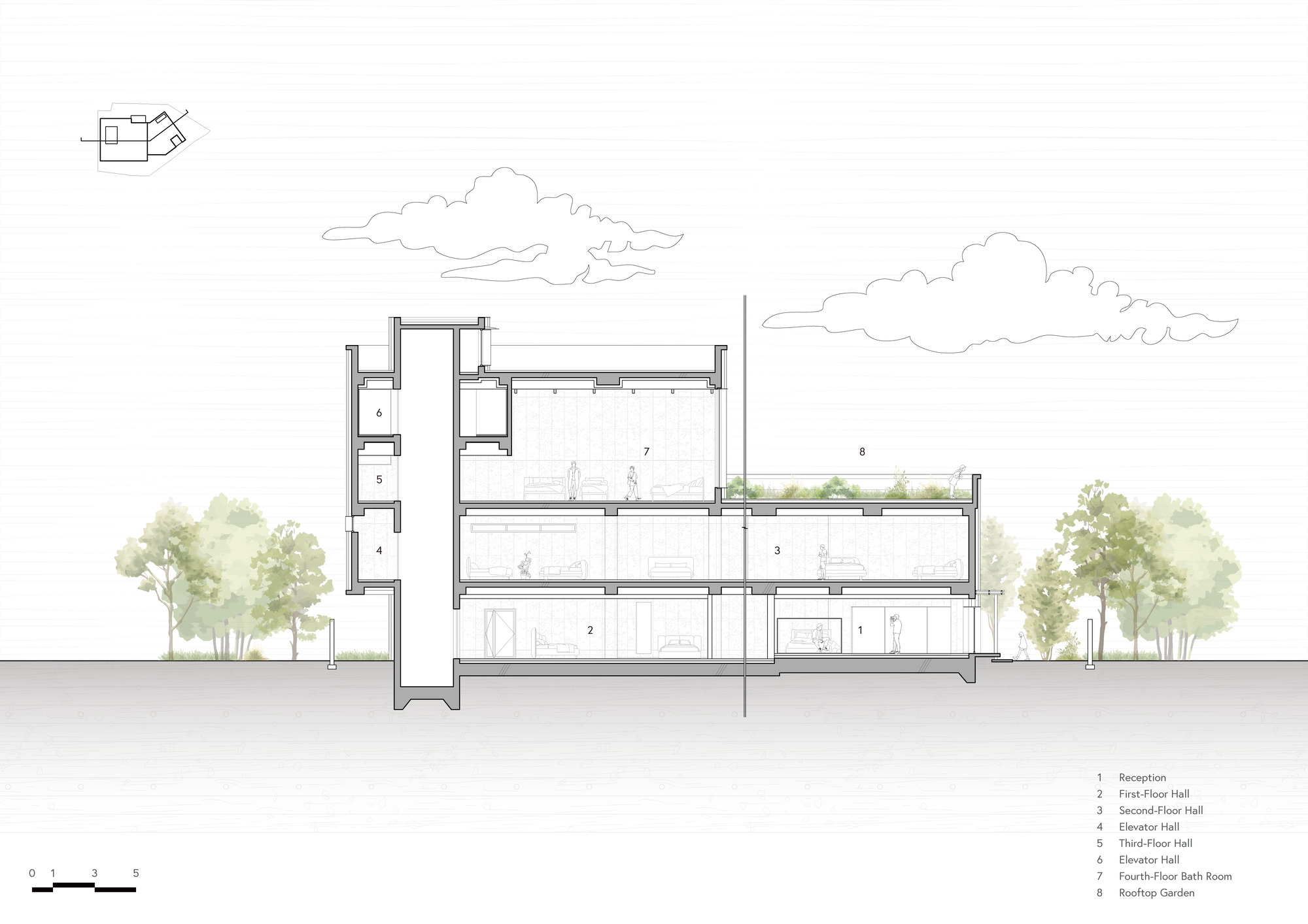
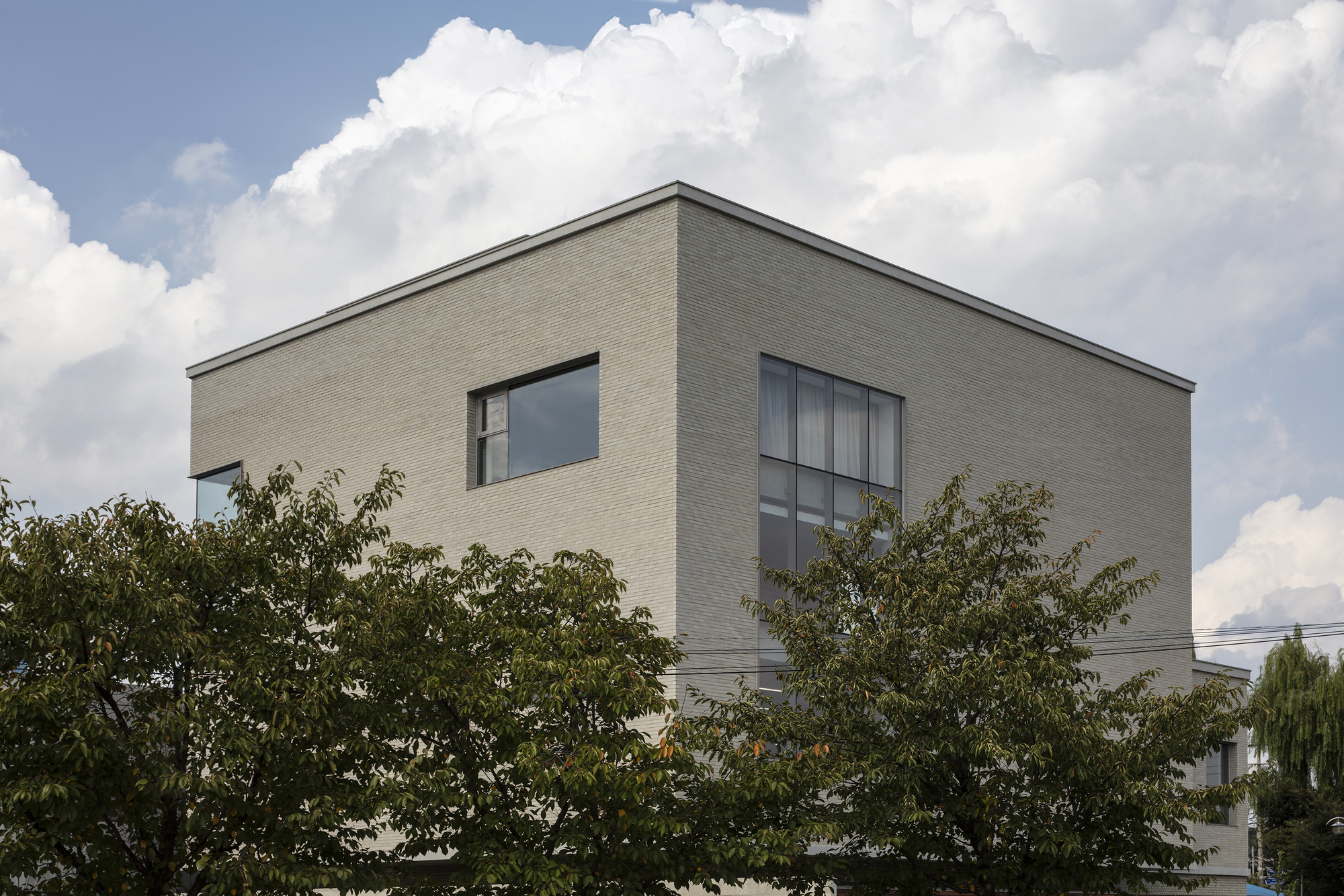
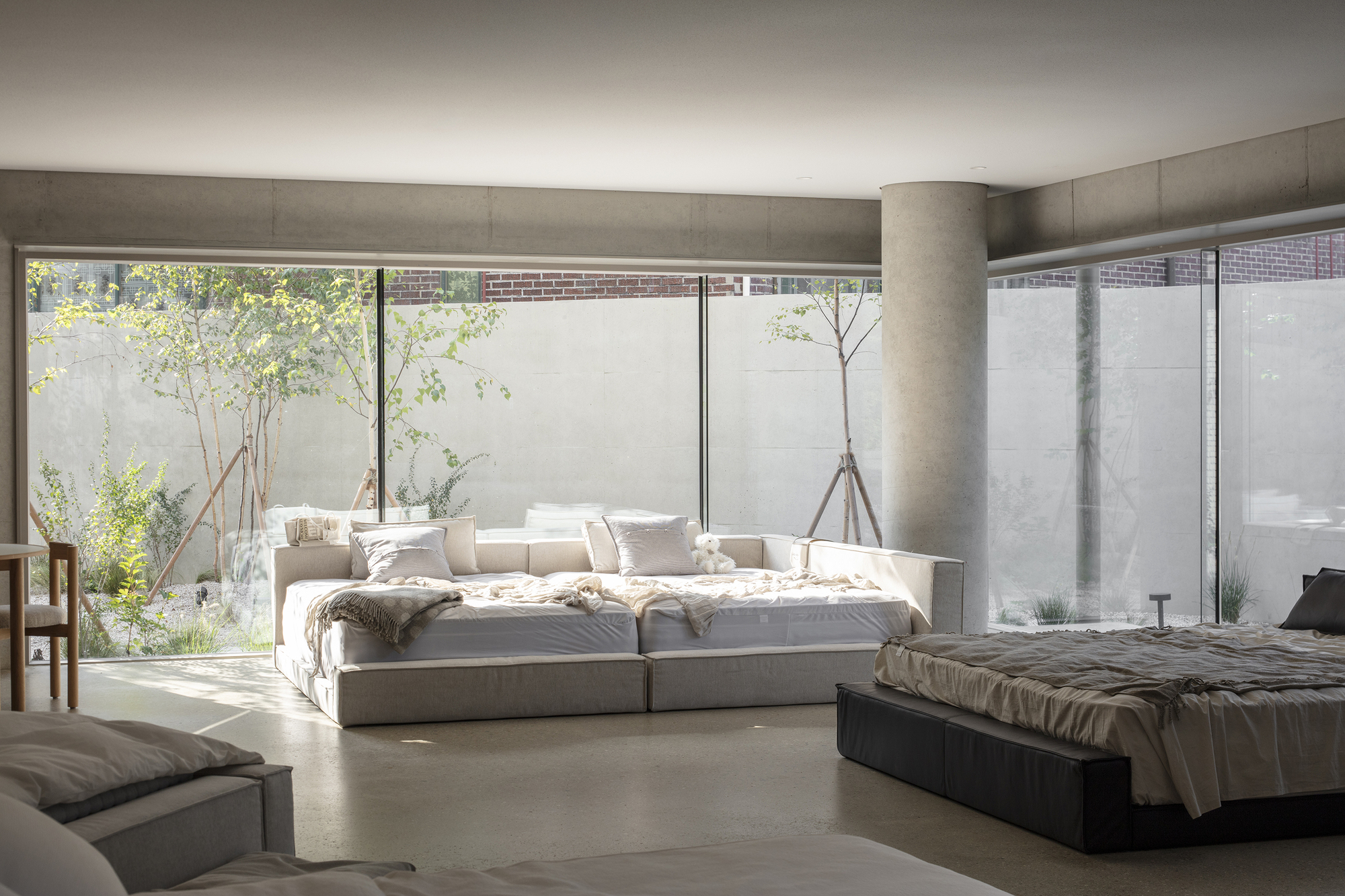
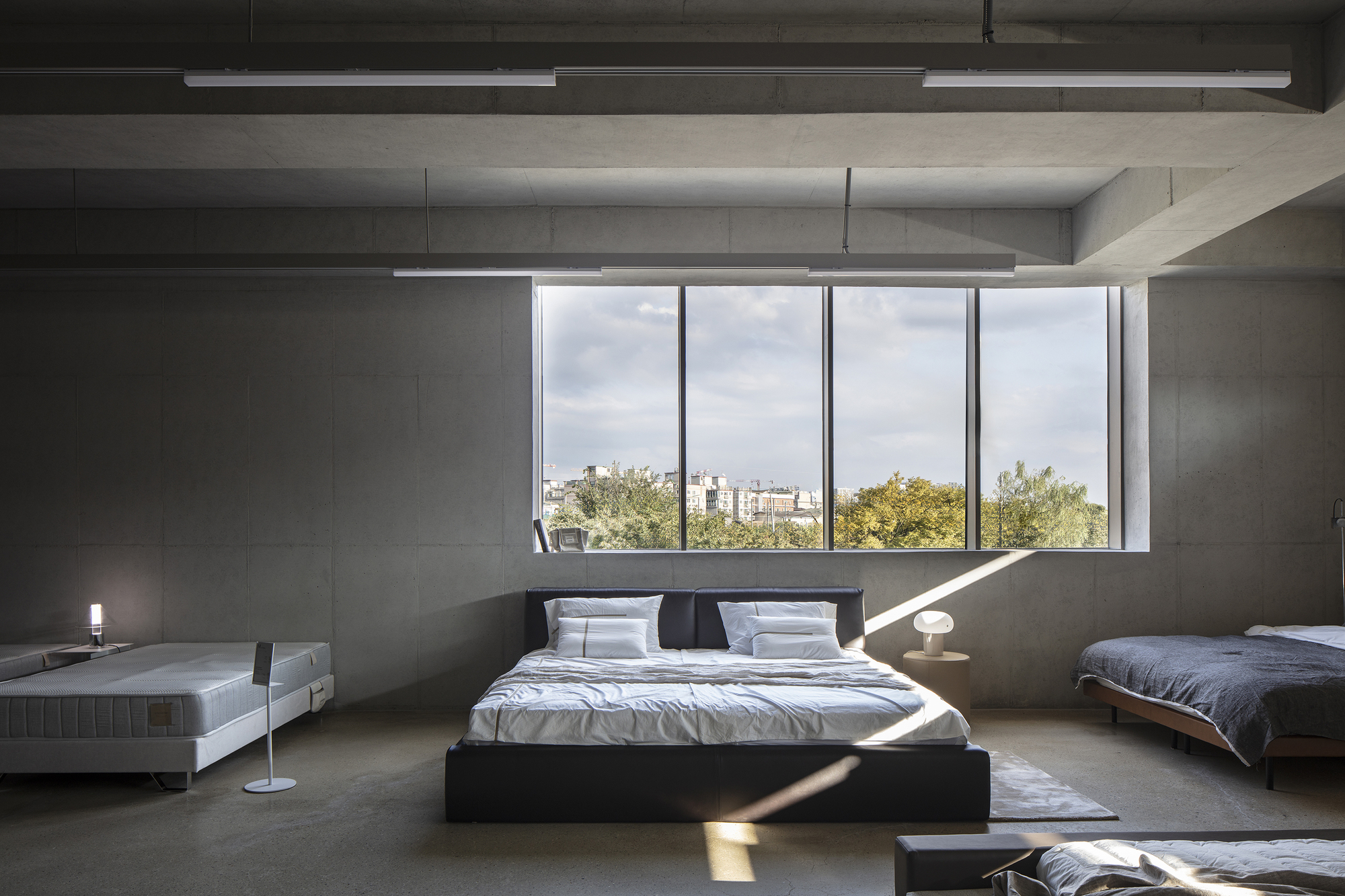
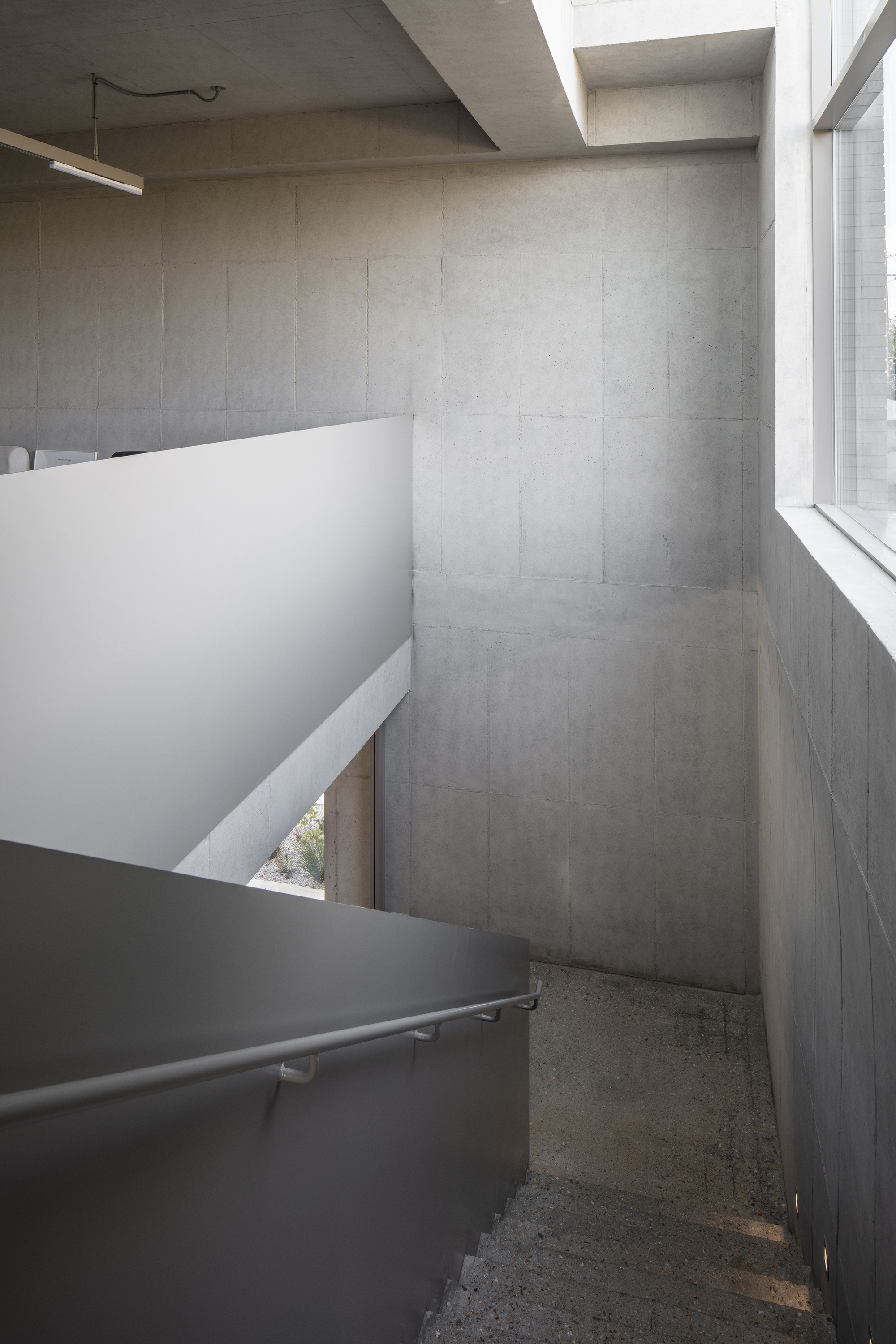
In order to create a showroom like a bedroom, the interior space focuses on natural lighting that minimizes artificial lighting and the scenery brought in through the windows. It was important for the first floor to draw in the outside scenery while not being visible from the outside.
For this reason, no windows were installed on the first-floor façade facing the outside, and windows were planned on the north façade so that the entrance garden could be viewed.
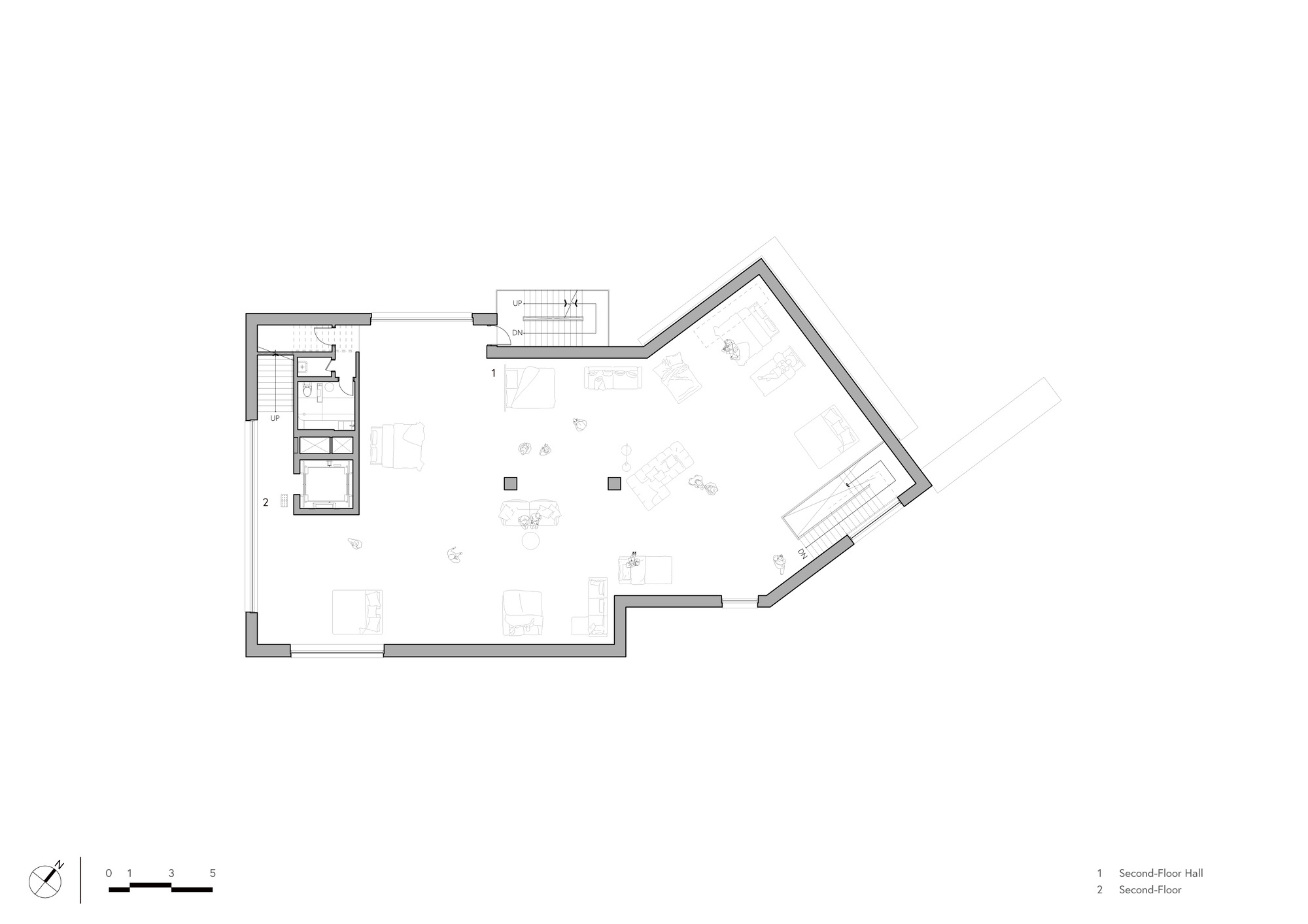
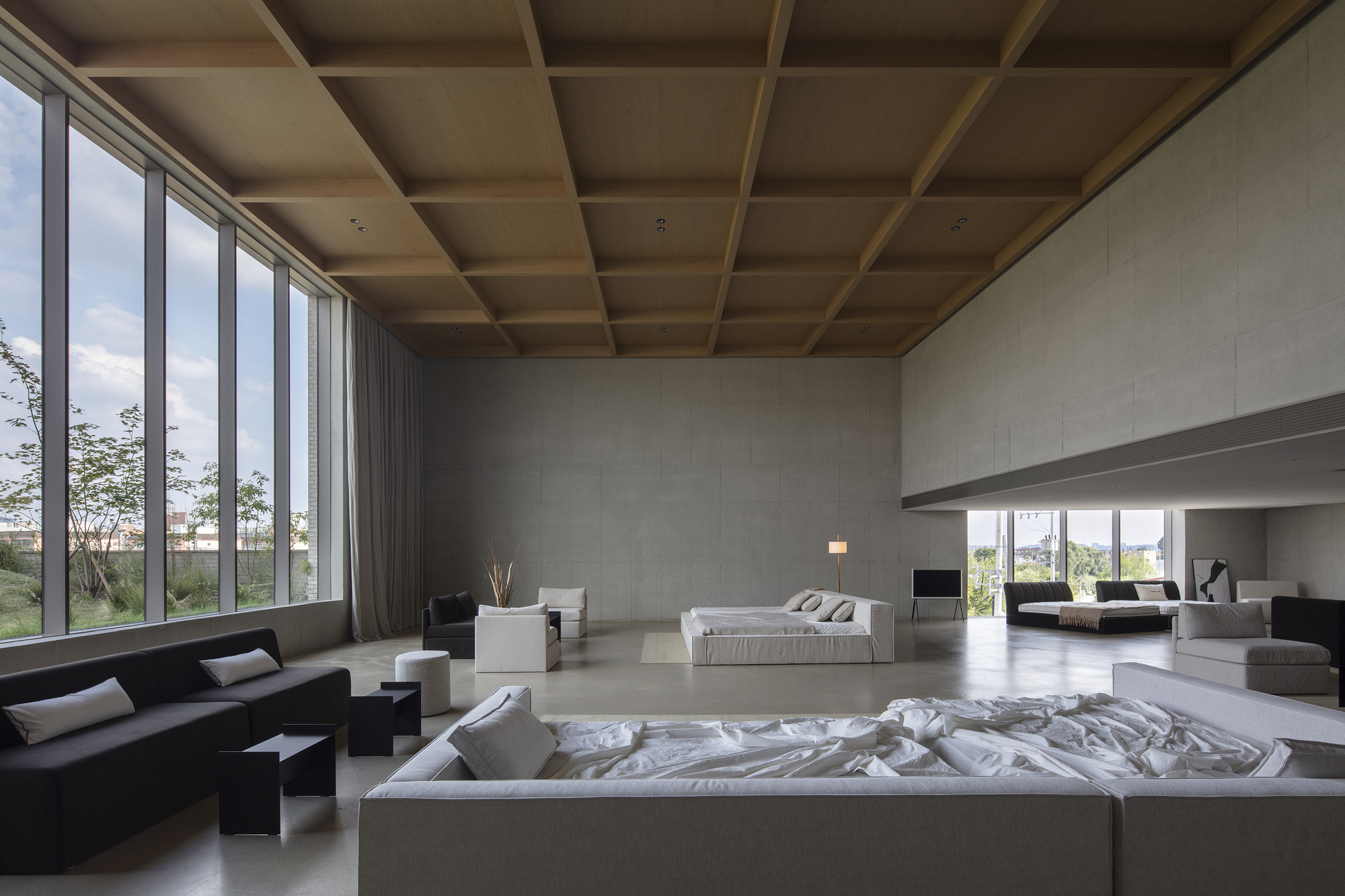
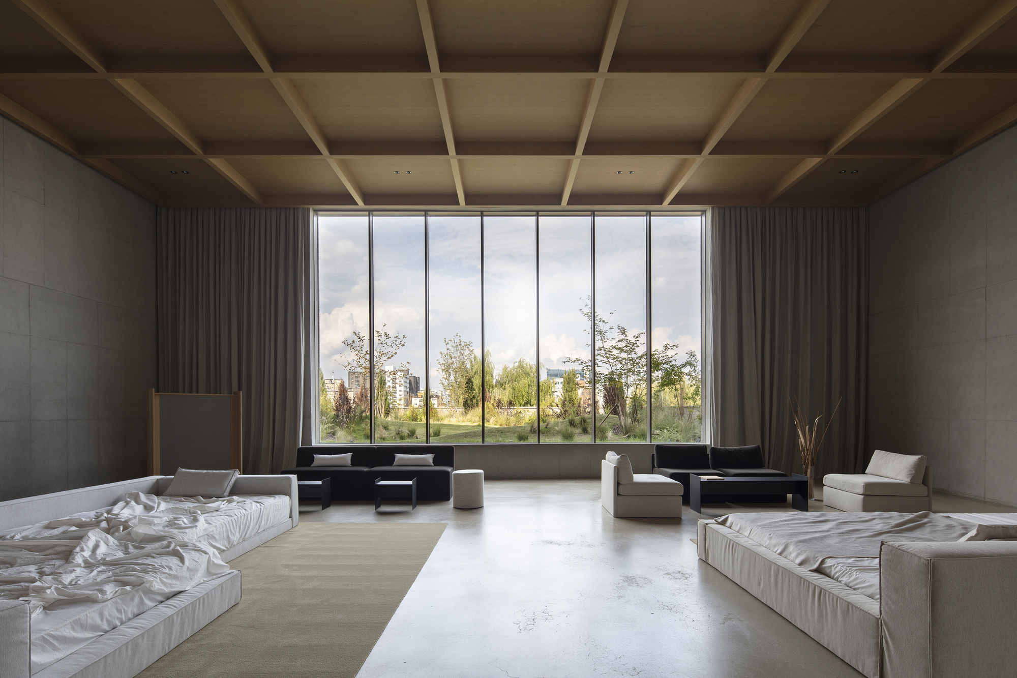
The second floor, which has a floor area of over 100 pyeong, has high windows and skylights to ensure even lighting throughout the space, and the space is intended to be hidden from the outside while still allowing the willow trees and the sky to be visible.
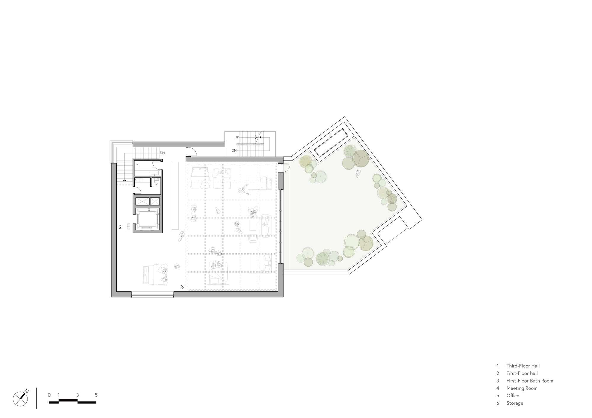
The third floor is the most important space in the entire program and is where dramatic spatial experiences take place.
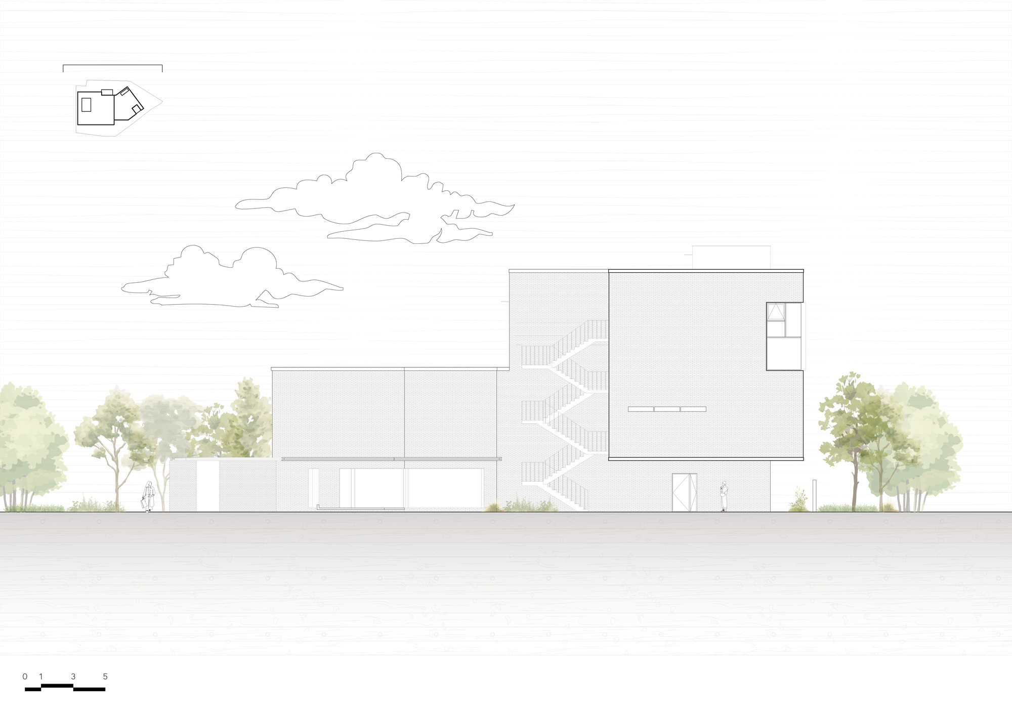
The 2.3m entry ceiling height changes significantly to 5m, and through the large windows that are over 4.5m high, the rooftop landscape and nature beyond are brought into the interior in an overscaled manner, providing an intense brand experience.
Since the flagship store must become a collection that expresses the brand, we considered the exterior finishing materials that could reflect the Staymore brand.
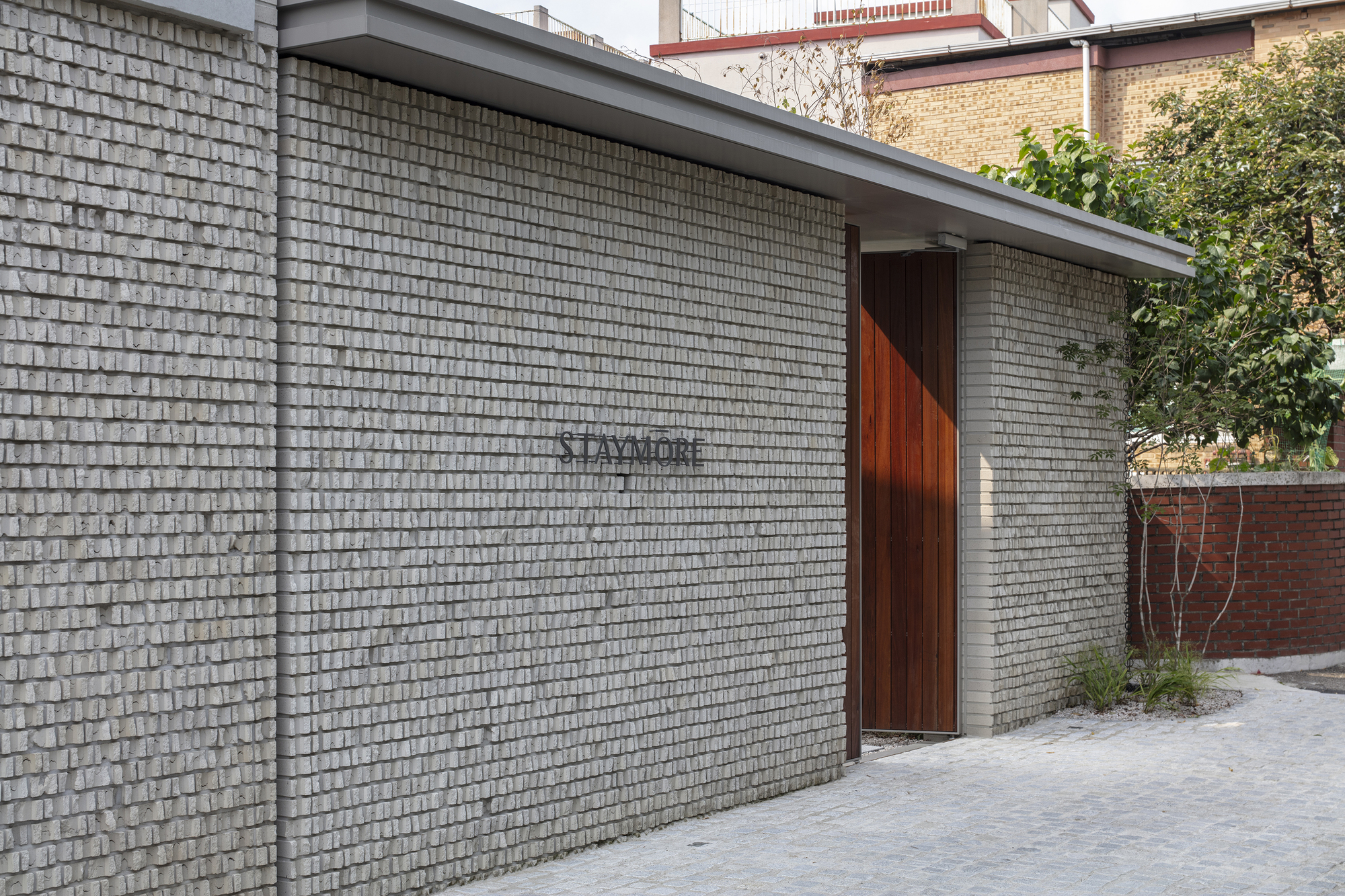
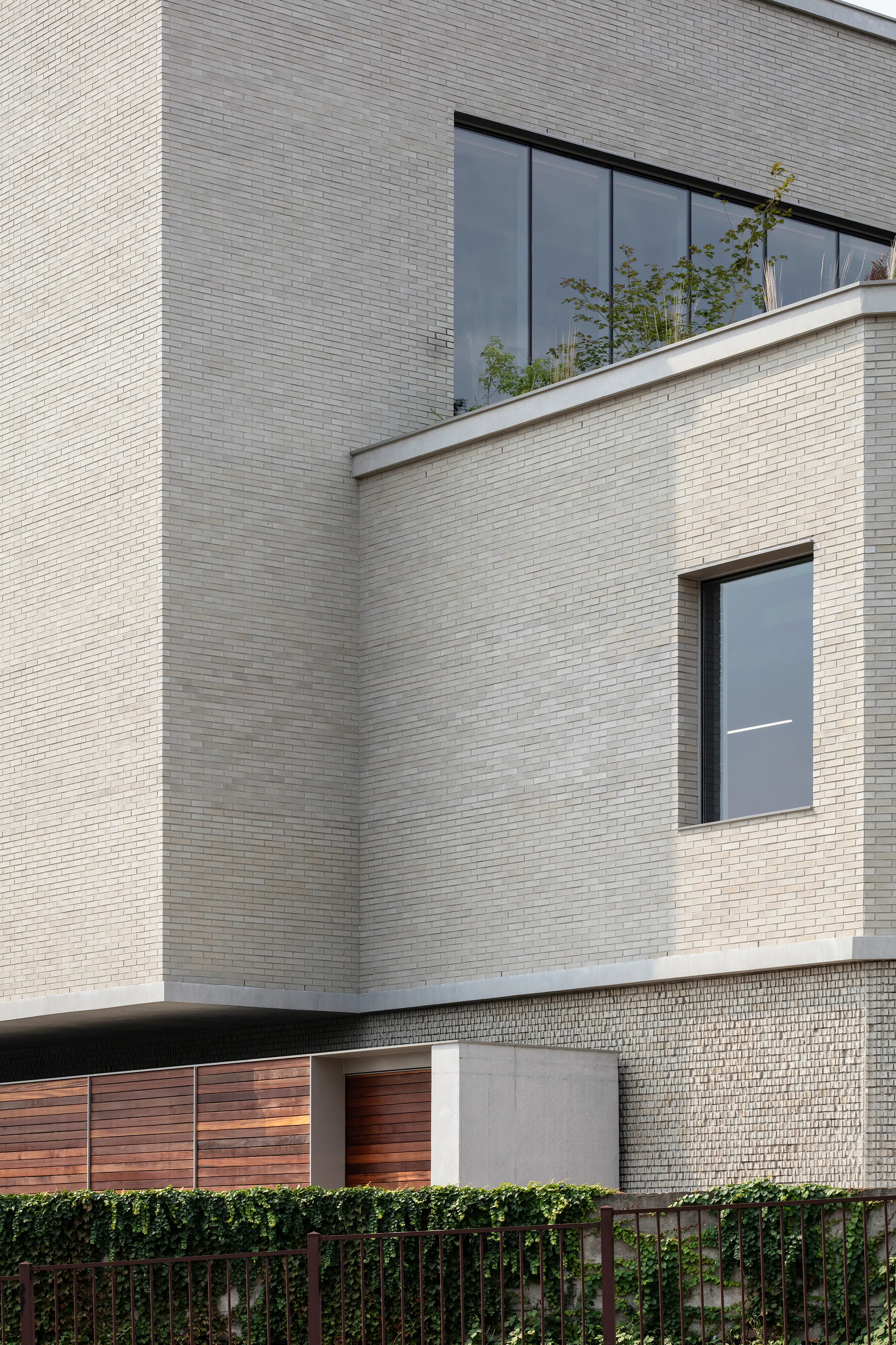
We shared the main materials used in Staymore products to understand the colors and textures, and finally selected rough bricks with a grayish beige color, exposed concrete, and wood so that the brand image could be projected onto the building.
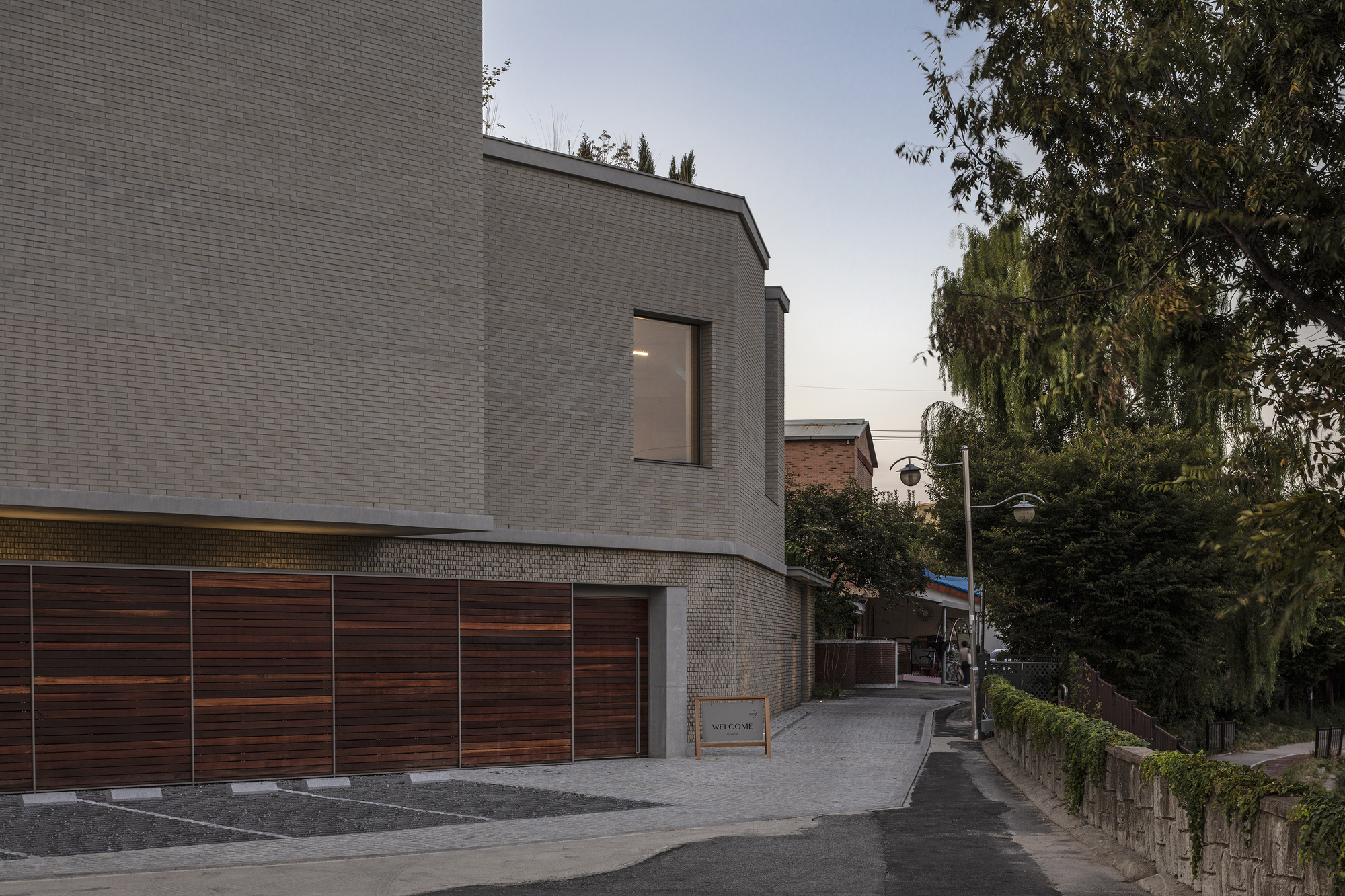
The main material, bricks, were planned to be clay bricks that are not too clean, but have a unique texture and color, so that the wide façade looks like a warm mass.
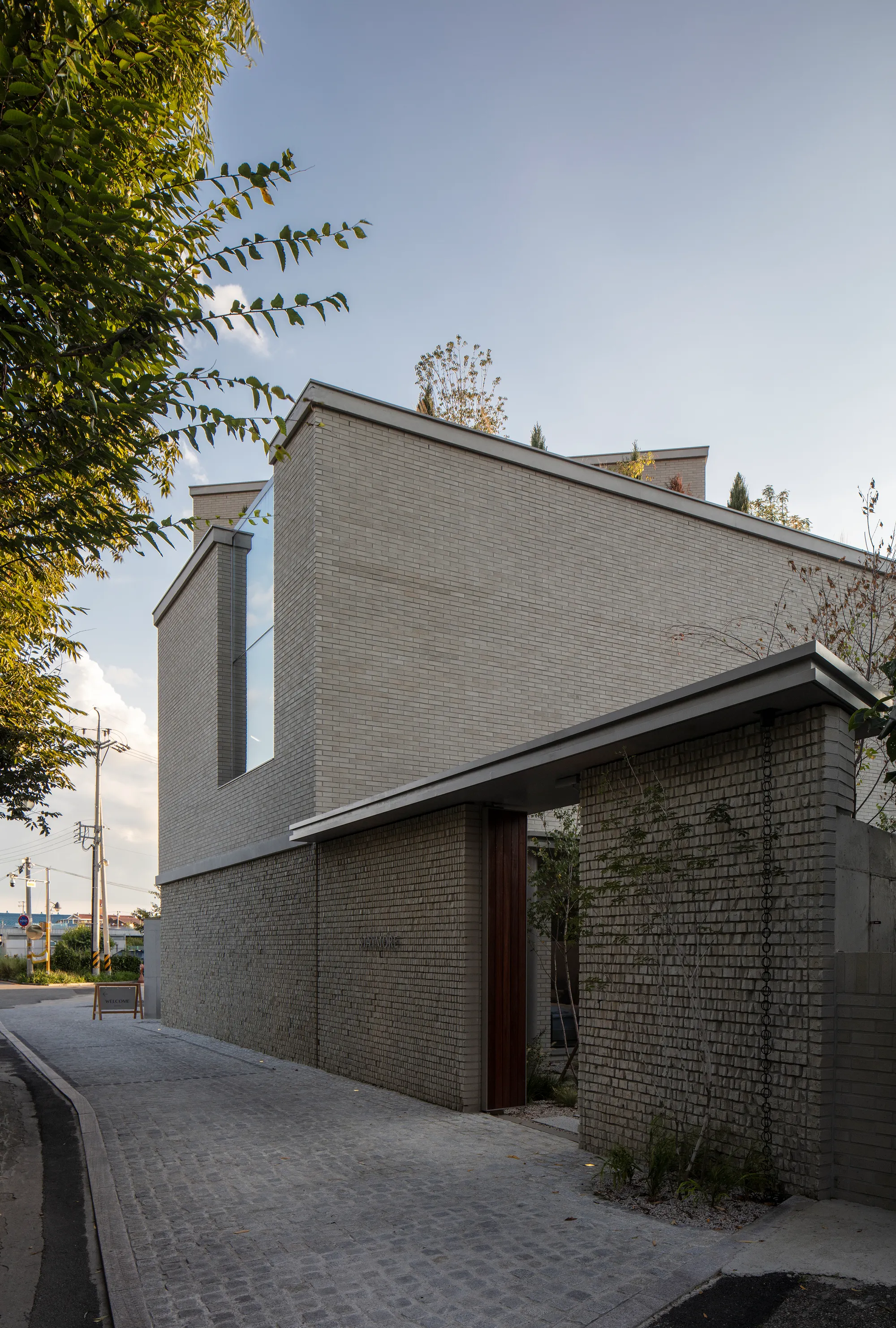
In addition, despite the scale of the building, a concrete belt was placed along the façade of the building, and the texture of the bricks was divided to emphasize the horizontality of the building so that it could be read as a mass that is laid as low as possible, like a single-family house.
The façade on the first floor feels like a complete wall because there are no windows that allow a view into the interior.
In order to stimulate the sense of touch and provide a pleasant walking experience on the surface that pedestrians encounter most closely, the bricks were split in half from the floor to the upper band of the first floor to maximize the texture, and the main gate at the end of the first floor façade was finished with wood and a small landscape was placed in the front for pedestrians to see.