Housing Project Oberzelg

HOUSING PROJECT OBERZELG
Esch Sintzel Architects
CATEGORY
Master Plan, Public Space, Residential
YEAR
2018
PHOTOGRAPHS
Philip Heckhausen
CONSTRUCTION MANAGEMENT
Caretta Weidmann AG, Zurich
ARCHITECTS
Katharina Stepien, Fabiano Andina, Mara Barzaghini, Matthias Berger, Jonas Blum, Jonathan Bopp, Nicolas de Courten, Jillin Ettlin, Nike Himmels, Nadine Jaberg, Christian Ott
LANDSCAPE ARCHITECTURE
Kuhn Landschaftsarchitekten GmbH, Zurich
PROJECT LEADER
Arza Hajdarevic
CONSTRUCTION ENGINEERING
Ernst Basler + Partner AG
COLOUR CONSULTANT
Archfarbe, Andrea Burkhard, Zurich
Text description provided by architect.
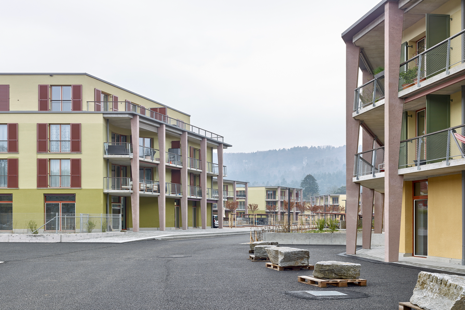
Concept. Politically, Sennhof belongs to the city of Winterthur, but geographically the suburb is clearly separated from the city area and forms a village exclave in the valley of the Töss.


The river not only shapes the topography, it also aligns the elements of the settlement in the direction of flow: Buildings, road, railway line, forest edges.
This also applies to the buildings and open spaces of the new Oberzelg settlement, which is squeezed between the cantonal road and the railway line.

For Esch Sintzel, the commission in Sennhof is one of the few that is not about densification, but about new planning on a green field site.
Instead of sharpening the existing identity of the site, the aim here is to develop a new - suburban - identity.


That is why this project is conceived from the public spaces, and why these public spaces are particularly explicitly designed as urban outdoor spaces that interact as a sequence of squares and alleys.
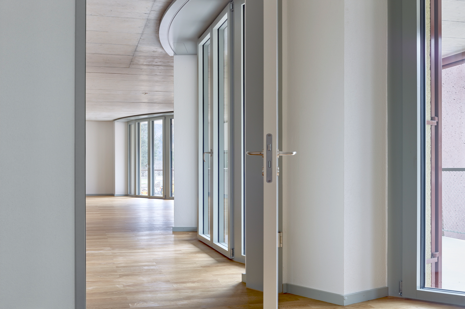
The squares are framed by airy loggias and elevated private gardens to invite individual appropriation and create a festive setting for living together in the settlement.


The reference to traditional settlements is continued in the construction - single-stone masonry with scratch plaster.
Colour Concept. The horizontal layering from heavy to light, from strong to diffuse colour emphasises the horizontal, elongated extension of the large housing estate.
The colour progression, however, is also intended to quietly hint at the marshy ground in the alluvial plain of the Tösstal: for the colour progression is intended to appear a little as if the houses had drawn water, as if the moisture had risen up the walls.
Incidentally, the colour differentiation in the horizontal is repeated in the awning hangings. Each storey has a different colour tone, rising from an earthy basic tone to increasing neutrality.
Each storey has a different colour tone, rising from an earthy basic tone to increasing neutrality.

The two sides of the development are different colours: the houses on the east side are in 'island moss' green with red folding shutters, the buildings on the west side are in 'Indian yellow' with green folding shutters.
The colour differentiations support the impression of 'anticipated appropriation' in their interaction, a state of age without simulated patina, so to speak.


The houses are supposed to look modern and at the same time as if they had always been there!


